
Future Proof Your Practice
Make the next step
feel simple.
The Engagement pillar:
clear pages, thoughtful design, easier contact.
Why engagement matters
Help a visitor feel ready to reach out.
They are looking for a fit
Someone arriving on your site may be uncertain about the help they need.
- Can this practice help with my concern?
- What would getting started involve?
Answer those questions in clear, welcoming language.
Your page can make it easier
Good design connects useful information to an understandable next step.
- Show the right services and people
- Make contact easy to find and use
Support an informed decision without applying pressure.
The aim is a useful inquiry from someone who fits your practice. A button click is only one part of that journey.
Your presenter · Moonraker
I’m Scott Pope.
Helping therapy practices make sense of search, AI and growth.
At Moonraker, I work with the educators, consultants and partners who support therapists in private practice.
Turn a clear professional presence into a website that helps people understand their options and reach out.

Practice example · Search Console clicks
Look at the evidence.
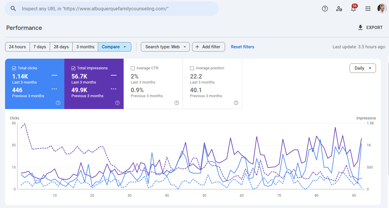
- Previous 3 months
- 446clicks
- Last 3 months
- 1.14Kclicks
Couples and family counseling practice. Exact comparison dates are not shown.
Practice example · Search Console clicks
EMDR, somatic therapy and intensives.
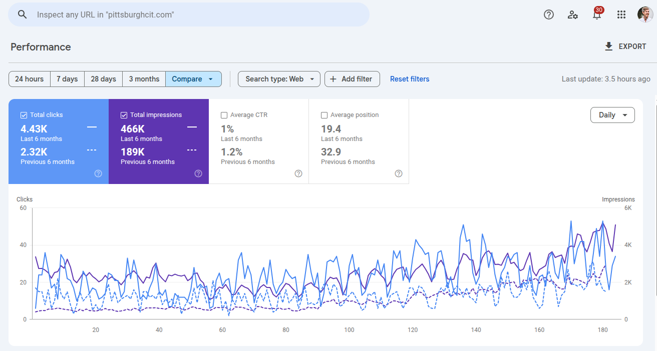
- Previous 6 months
- 2.32Kclicks
- Last 6 months
- 4.43Kclicks
EMDR, somatic therapy and multi-day intensives. Exact comparison dates are not shown.
Practice example · Search Console clicks
ADHD and autism assessments.
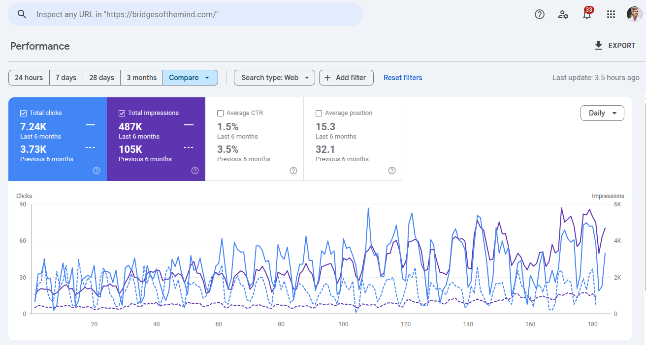
- Previous 6 months
- 3.73Kclicks
- Last 6 months
- 7.24Kclicks
Psychological assessments, including ADHD and autism testing. Exact comparison dates are not shown.
The CORE Marketing System™
Four pillars.
One clearer picture of your practice.
- C
Credibility
Do you exist, and are you qualified?
- O
Optimization
What do you treat, how, and where?
- R
Reputation
What supports your expertise?
- E
Engagement
How can someone connect with you?
04 · Engagement
Make reaching out
feel easier.
Help the right people understand your practice and choose their next step.
Clarity, reassurance and a practical path to contact you.
Design around the visitor
Fit. Confidence. A next step.
Let each page help someone make a little more sense of their options.
- Fit
Recognize the right help
Name the concern, audience and services the page is about.
- Trust
Understand your practice
Show the people, relevant experience and what getting started involves.
- Act
Know how to connect
Offer a clear, appropriate way to ask a question or request an appointment.
Treat conversion as a supported decision, not a race to collect the most clicks.
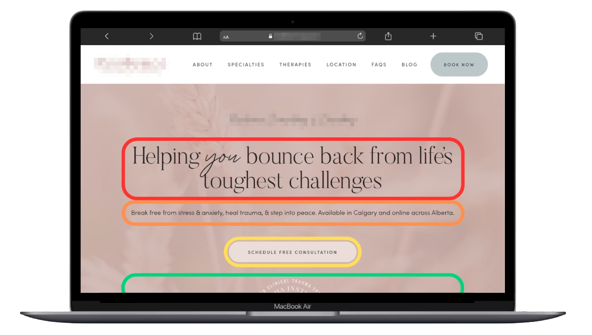
Your hero · The first section people see
Give the opening a clear purpose.
- 01
Recognize theirconcern.
Use a clear, empathetic headline.
- 02
Explain yourservice.
Say who you help, how and where.
- 03
Offer anext step.
Use a button that describes the real action.
- 04
Add relevantreassurance.
Show accurate credentials or useful context.
brings you here.
Service · Audience · Location
Relevant, verifiable experience
Use accurate wording, real offers and verifiable credentials.
See it in practice · Four useful elements
Make the opening do its job.
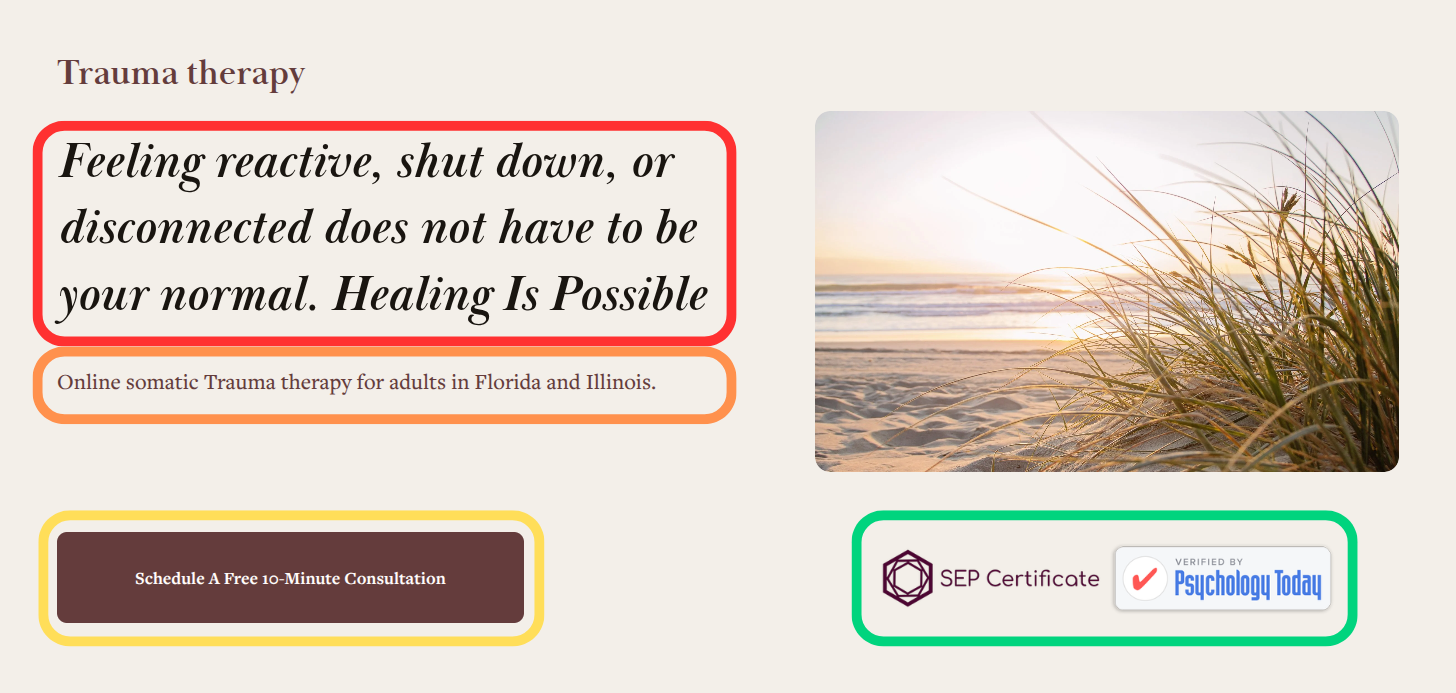
Use a real offer, accurate wording and permitted badges.
See it in practice · Desktop to mobile
Keep the message clear on a phone.
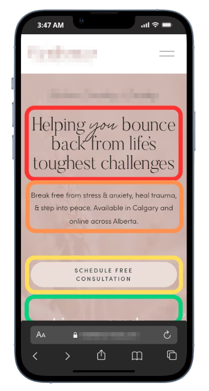
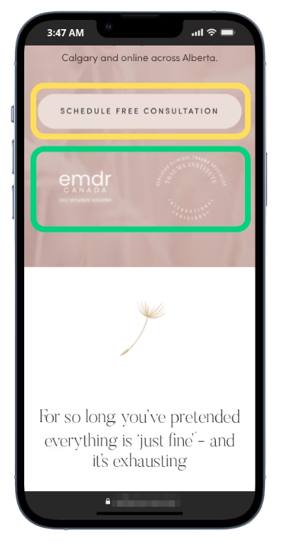
Keep the reading order clear. Let the page scroll naturally.
Clear language · A recognizable fit
Help people recognize the right page.
Be specific about the help
Name the concern or situation the page addresses in words visitors understand.
- Anxiety support for adults
- Couples counseling in your actual service area
Specificity can be warm and welcoming.
Keep the promise realistic
Explain your approach without implying the same result for everyone.
- Describe support and possibilities
- Have a clinician review clinical statements
Read the headline aloud: would a new visitor understand it?
Reassurance · Useful information nearby
Make the practice feel knowable.
Help people learn who you are and how the practice works.
- 01
People
Show the real clinician.
Use an approachable photo and a short introduction linked to the full bio.
- 02
Experience
Explain relevant qualifications.
Use accurate titles and links to public verification where available.
- 03
Recognition
Keep the context clear.
Use permitted professional endorsements with permission and attribution.
- 04
Process
Explain what happens next.
Show how an inquiry becomes a conversation and, where appropriate, an appointment.
Call to action · A clear invitation
Let the button say what happens.
Match the actual destination
Use wording that tells visitors what the next screen will let them do.
- “Request a consultation” for an inquiry form
- “Choose a consultation time” for a live scheduler
“Contact us” can also work when the destination is clear.
Match your real offer
State a duration or price only when it is accurate for that appointment.
- Do not promise a free call unless you offer one
- Avoid false urgency or guaranteed outcomes
An appointment request is not yet a confirmed appointment.
Call to action · Useful placement
Keep a clear route to contact.
Use consistent wording for the same action across the site.
- Open
Make it easy to find
Offer a useful contact route in navigation and the page opening.
- Read
Place it in context
Add an invitation after details that help someone decide what to do.
- Close
Finish with the next step
End the page with a clear invitation and any useful expectations.
Make buttons distinct and comfortably tappable without interrupting the reading experience.
Your bio · Human and verifiable
Introduce the person.
- 01
Connect with thereader.
Explain who you help and your approach.
- 02
Sound likeyourself.
Write naturally, often in the first person.
- 03
Show yourexperience.
Include a real photo and accurate qualifications.
- 04
Invite the nextconversation.
Link to the right contact option.
Your approach.
Who I help · How I work
Photo · Qualifications · Relevant experience
Service pages · Clear expectations
Help people understand the fit.
- 01
Name theconcern.
Explain the service in familiar language.
- 02
Describe who it isfor.
Clarify the people and situations you support.
- 03
Explain theexperience.
Cover approach, format and what to expect.
- 04
Show how tobegin.
Offer a relevant inquiry or booking route.
you are seeking.
Who it is for · What we offer
Approach · Format · Next steps
Use modality names where useful, with a plain-language explanation of what they mean.
How it works · Your actual process
Make the first steps less unknown.
Describe the path a new visitor will really follow.
- Reach
Make an inquiry
Explain how to contact you and what the first conversation involves.
- Talk
Discuss needs and fit
Describe how you answer questions, explain options and agree on next steps.
- Begin
Arrange the first appointment
Explain scheduling, any required preparation and how the work starts.
Explain a process you can deliver. Do not promise a particular clinical outcome or timeline.
Mobile design · Read, navigate, act
Try the whole journey on your phone.
Use your own device as well as the desktop preview.
- 01
Reading
Keep the message legible.
Check type size, line length, spacing and the order of the page.
- 02
Navigation
Try the real controls.
Open menus, follow links and check the contact button with a thumb.
- 03
Contact
Complete the next step.
Test the form, scheduler and click-to-call link where available.
- 04
Space
Keep content reachable.
Check banners, the on-screen keyboard, orientation and text zoom.
Contact and booking · Match the workflow
Offer a route the practice can support.
Direct scheduling
A scheduler can help when you have appropriate appointment slots to offer.
- Show the correct appointment type and availability
- Explain whether a booking needs confirmation
Check setup, accessibility and privacy requirements.
An inquiry first
A short form or phone option can work when you need to discuss fit first.
- Explain who responds and what happens next
- Offer an alternative if the main tool cannot be used
Choose for your practice’s process, not the tool’s popularity.
Contact forms · A manageable first step
Ask only what you need to respond.
Keep the request focused
Collect the details needed for this first contact.
- Make required fields and labels clear
- Avoid inviting sensitive clinical details on a general form
Review collection, storage and notifications with the practice.
Give honest expectations
Explain what happens after submission and when a reply can normally be expected.
- Use a response window the team can meet
- Describe the actual communication process
Do not label an unverified setup “confidential” or “secure”.
Shorter is useful when the form still collects what this step actually needs.
After contact · Useful feedback
Make the result of an action clear.
Test the success path and the moments when something goes wrong.
- Sent
Confirm what was received
Distinguish an inquiry from a confirmed appointment and describe the next step.
- Fix
Explain what needs attention
Show clear errors near the fields and preserve the information already entered.
- Help
Offer a way forward
Give a practical alternative if the form or scheduler is unavailable.
Use accurate on-page feedback and, where configured, a confirmation message that avoids repeating sensitive details.
Performance · The experience people have
Make the page feel ready to use.
Check more than a single speed score.
- Load
Show useful content quickly
Review how long the main page content takes to appear.
- React
Respond to interaction
Try menus, buttons and forms while the page is loading and afterward.
- Stay
Keep the layout stable
Check for moving text, images or buttons as other content arrives.
Core Web Vitals cover loading, responsiveness and visual stability. They do not guarantee rankings or bookings.
Performance · Practical improvements
Start with the largest obstacles.
Use PageSpeed Insights and a real-device check to choose the work.
- 01
Images
Serve an appropriate file.
Resize and compress images without sacrificing useful detail.
- 02
Extras
Review what the page loads.
Remove unnecessary plugins, embeds and third-party scripts.
- 03
Delivery
Check the technical setup.
Ask your web team about caching, fonts and image dimensions.
- 04
Evidence
Compare before and after.
Use the same conditions. Check field data when available and retest the contact path.
FAQs · Useful information before contact
Answer what people need to know.
Start with the questions your practice is actually asked.
- 01
Cost
Explain fees and insurance.
Describe payment options, coverage limits and what someone should confirm.
- 02
Beginning
Describe the first appointment.
Explain the format, preparation and what the initial conversation involves.
- 03
Format
Clarify where and how.
Describe office and telehealth options, with accurate service coverage.
- 04
Fit
Leave room for questions.
Explain how to discuss suitability, frequency or uncertainty about starting.
FAQs · Clear and current
Give a direct, helpful answer.
Use your practice’s own details
Answer in the warm, plain language you would use in a conversation.
- Keep the first answer short and specific
- Link to a fuller explanation when useful
Avoid fixed timelines for how long everyone’s therapy will take.
Keep the answers accurate
Review fees, availability, service scope and policies when they change.
- Resolve conflicting information across pages
- Use real questions instead of filler for search engines
A useful FAQ does not need a promise about SEO or AI rankings.
Visual design · Calm, clear and recognizable
Make the design feel considered.
Use a consistent visual language
Keep a small set of type styles, colors and button treatments across pages.
- Use clear headings and short paragraphs
- Give separate ideas room to breathe
Choose colors that suit your practice and remain readable.
Choose images with a purpose
Use appropriate real photos of your clinicians or space where available.
- Check image quality and permission
- Choose imagery that supports the message
Do not imply that stock models are your clinicians or clients.
Accessibility · A usable path to contact
Make the next step usable.
Include these checks when reviewing the page.
- 01
Contrast
Keep important text readable.
Check text, links and buttons against their actual backgrounds.
- 02
Keyboard
Try the path without a mouse.
Follow visible focus through menus, contact links and the form.
- 03
Controls
Give targets enough room.
Check touch size, spacing, clear labels and useful error messages.
- 04
Adaptation
Check a changed view.
Increase text size, turn the phone and confirm content stays reachable.
Your engagement checklist · The page
Review the first impression.
Start with your homepage and one important service page.
- 01
Opening
Make the purpose clear.
Check the headline, service description, audience and next step.
- 02
People
Show who is behind it.
Review real photos, useful bios and accurate qualifications.
- 03
Process
Explain what happens.
Check service details, practical FAQs and the first steps.
- 04
Recognition
Keep the context accurate.
Review professional quotes, permissions, affiliations and links.
Your engagement checklist · The journey
Follow the whole path to contact.
Finish by trying what you are asking a visitor to do.
- 01
Action
Follow the real button.
Check wording, destination, appointment type and availability.
- 02
Form
Try success and errors.
Review fields, expectations, confirmation and the team’s actual receipt.
- 03
Devices
Use a phone and keyboard.
Check reading order, menus, forms, zoom and reachable controls.
- 04
Performance
Check the useful experience.
Review loading and interaction, then fix and retest the largest obstacles.
Your next step
Let’s talk about
your practice.
Bring your questions to a free strategy call.

Professional recognition · Carry Part 4 forward
Show the context behind recognition.
Quotes and public work
Show appropriate professional endorsements, publications and appearances.
Keep client testimonials out of this lesson’s request plan.
Credentials and affiliations
Use accurate qualification names and current professional status.
Membership or a media appearance does not imply endorsement.